The Chemistry of Ice Cream
The Chemistry of Ice Cream Brianna G.
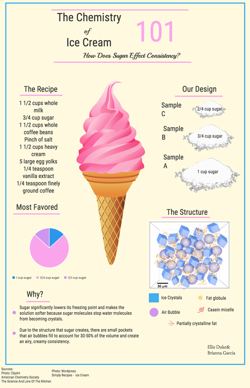
How can we measure the qualities and desirability of a finished recipe both quantitatively and qualitatively in order to determine the success of our recipe experimentation?
It’s hard to determine the perfect recipe, there are many people with many many taste buds, and we all like and dislike different things. But I think there can be a balance with different foods and the way we conceive them. When making a big quantity of food it is easy to forget that it also needs to have quality. When you can take time making food you can pay attention to the quantity of different foods that are being put into your recipe, for example, eggs or sugar, how much are you using? And will it work together? The quality is all about the taste, consistency, texture, temperature that it should be, and maybe even how healthy your food is or isn't can determine the success of a recipe.
For my test I had to determine how much sugar was going into our ice cream and why more sugar would make it better or worse and if less sugar would make it better or worse. What I learned over the course of this project is that sugar makes the cream in ice cream less crystallized and hard like ice, and more soft and better to eat. But not only does the sugar determine the ice cream’s fluffiness, so does the air pockets that form in the ice cream. A perfect amount of stirring is key.
In what way(s) is cooking like doing science and in what way(s) are they different? How are a cook and a food scientist similar or different?
Cooking is not only an art but it also involves science, even if we don’t realize it. Cooking has different molecules combining together to create the perfect plate of food that includes taste, texture, smell, etc. That’s why we have food scientists, so you will enjoy your food and buy more of it! Working in the kitchen is like working in a lab, you’ll need your ingredients-- your chemicals. Just like chemistry there is a procedure to follow in making almost everything. When I am in a lab I know I need to measure everything exactly, same when I am cooking a cake (sometimes). Even though some cooks won’t consider themselves scientists they still have a lot in common.
Putting two and two together to get the perfect product is everything a cook and scientist does. As a cook myself I would say that I don’t always pay absolute perfect attention to everything like a chemist should, and sometimes my product still turns out delicious, (not always though). I think it’s important to have fun with cooking but to stay extremely safe when working with chemicals in a lab. Both food scientist and cooks have their differences and similarities, but all that truly matters is how good the food tastes.
Energy & the Environment
Energy & the Environment: Critical Consumer of Science & Reflection
Critical Consumer of Science
http://www.icebike.org/why-ride-a-bike/ Reliable, most biased
Reason: This website was reliable and had great sources but they were very biased towards biking and why it is better than taking automobiles.
http://www.govtech.com/transportation/How-Transportation-Technologies-Will-Change-Everything-.html Most reliable, least biased
Reason: This website was the most reliable because it had the best sources and it was written well. It also had both sides of the story and tried to stay unbiased.
http://www.apta.com/gap/policyresearch/Documents/facts_environment_09.pdf
Least reliable, biased.
Reason: This website gave me good information but I’m not sure where the facts were coming from and they were biased towards transportation.
https://www.transportation.gov
Most reliable, least biased
Reason: The Department of Transportation is meant to be a an extremely reliable source and it shouldn't be biased to any transportation efforts. I didn’t take many facts from this site though because it wasn't directed towards my info graphic.
Primary: Department of Transportation
The Department of Transportation is a primary source because it is coming straight from the source and it should be an extremely reliable source.
Primary: Policy Research- Transportation
This also came from The American Transportation research, which is a first source.
Secondary: How Transportation Technologies Will Change Everything
This is secondary source because it is stemming from an article about technology and our vehicles.
Secondary: Ice Bike- Why ride a bike
This is a secondary source because it’s based off a biking website that promotes bikes.
Abstract of Policy Research Transportation is looking at public transportation playing a significant role in finding smart solutions to the challenges facing America today.
The author of this paper is Michael D. Meyer and I was unable to find when it was published but it comes from the American Public Transportation Association. I found different facts stated and statistics about America's transportation.
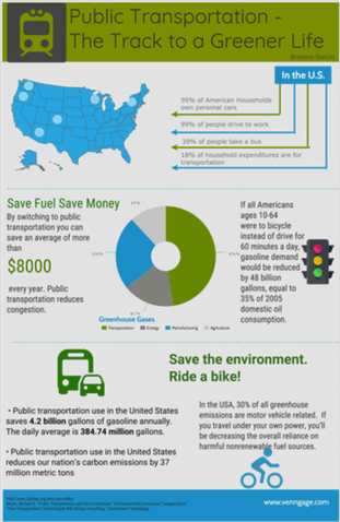
Hello, middle school student. I’m here to teach you about fossil fuels, the greenhouse effect, and climate change. First let's start with climate change as a whole. Climate change is the a change in global or regional climate patterns. Without pollution the earth would naturally have change in weather patterns but with humans the process had sped up. Carbon dioxide produced by the use of fossil fuels has created climate change. Fossil fuels are the natural gases we pull from the earth and emitting gases into our atmosphere. Which is also known at the greenhouse effect, this is the process of keeping the gases in our atmosphere which makes it warmer, hence the reason we don’t have snow days anymore and it snows in January.
Scientists and engineers have made our lives better because of the advancements we’re receiving. We don’t have to work as hard for the things we want and they are advancing us as a nation. And now that we do have these advancements we can focus on bettering our world. Without scientists we wouldn’t have answers to our questions.
Using cars we use to get to and from work and school and our needs daily are constantly emitting CO2 emissions and creating the problems we have today (climate change). I directed many of my viewers to use other resources such as bikes, buses, or carpooling to cut our CO2 emissions and help out our planet.
Critical Consumer of Science
http://www.icebike.org/why-ride-a-bike/ Reliable, most biased
Reason: This website was reliable and had great sources but they were very biased towards biking and why it is better than taking automobiles.
http://www.govtech.com/transportation/How-Transportation-Technologies-Will-Change-Everything-.html Most reliable, least biased
Reason: This website was the most reliable because it had the best sources and it was written well. It also had both sides of the story and tried to stay unbiased.
http://www.apta.com/gap/policyresearch/Documents/facts_environment_09.pdf
Least reliable, biased.
Reason: This website gave me good information but I’m not sure where the facts were coming from and they were biased towards transportation.
https://www.transportation.gov
Most reliable, least biased
Reason: The Department of Transportation is meant to be a an extremely reliable source and it shouldn't be biased to any transportation efforts. I didn’t take many facts from this site though because it wasn't directed towards my info graphic.
Primary: Department of Transportation
The Department of Transportation is a primary source because it is coming straight from the source and it should be an extremely reliable source.
Primary: Policy Research- Transportation
This also came from The American Transportation research, which is a first source.
Secondary: How Transportation Technologies Will Change Everything
This is secondary source because it is stemming from an article about technology and our vehicles.
Secondary: Ice Bike- Why ride a bike
This is a secondary source because it’s based off a biking website that promotes bikes.
Abstract of Policy Research Transportation is looking at public transportation playing a significant role in finding smart solutions to the challenges facing America today.
The author of this paper is Michael D. Meyer and I was unable to find when it was published but it comes from the American Public Transportation Association. I found different facts stated and statistics about America's transportation.
Hello, middle school student. I’m here to teach you about fossil fuels, the greenhouse effect, and climate change. First let's start with climate change as a whole. Climate change is the a change in global or regional climate patterns. Without pollution the earth would naturally have change in weather patterns but with humans the process had sped up. Carbon dioxide produced by the use of fossil fuels has created climate change. Fossil fuels are the natural gases we pull from the earth and emitting gases into our atmosphere. Which is also known at the greenhouse effect, this is the process of keeping the gases in our atmosphere which makes it warmer, hence the reason we don’t have snow days anymore and it snows in January.
Scientists and engineers have made our lives better because of the advancements we’re receiving. We don’t have to work as hard for the things we want and they are advancing us as a nation. And now that we do have these advancements we can focus on bettering our world. Without scientists we wouldn’t have answers to our questions.
Using cars we use to get to and from work and school and our needs daily are constantly emitting CO2 emissions and creating the problems we have today (climate change). I directed many of my viewers to use other resources such as bikes, buses, or carpooling to cut our CO2 emissions and help out our planet.
Energy & the Environment: Project Refinements
Brianna Garcia
Steve’s from Google Classroom-
"Hi Brianna, This infographic does a great job of conveying information through short phrases and images. You use icons well to help reinforce statements. I do see the lack of "passion" and that it is not an original or unique story. Here are a few suggestions or questions to think about related to refinement. 1) Connect sources to claims via superscripted numbers. 2) Add a label to the horizontal axis on your graph. 3) Make claims more specific if possible, particularly in uppermost panel. 4) Is there significance to the gas pump icons? What is it? 5) What goes into the assumptions of an $8000 a year savings? 6) How many cars are owned by Americans? 7) How could you integrate a passion into this? 8) Are uber or other ride-sharing companies changing our driving patterns? This is a super relevant topic and a nice aesthetic design. I look forward to seeing you "own" it more and I hope you publish this. Steve"
4. Alan’s feedback: (“sticky notes” are separate and on the PDF I turned in)-
Brianna:
You have a good topic, however you haven't visualized the most important data. It would be good if you put the numbers into context with a visual representation (see edited file attached). That would make this a much stronger infographic. I also think you should check out the US department of transportation site for data. I think that you are on the right track (sorry for the bad pun), but I would like to see the words turn into a visual representation of the data using graphs or images scaled to size.
The only element that you are missing, which you might want to consider, is bike paths. Some cities, such as Minneapolis, Boulder, and Madison, WI, have large biking populations. Maybe, Durango too?
Refinements-
Steve and Alan gave me great advice on how to make my infographic better and more professional. On my first infographic I didn’t have a lot of passion and I was missing a story with it, Steve really wanted me to “own” my infographic and I think that shows with my final draft. I had a lot of random icons that didn’t really fit and different facts that weren't necessarily backed up. Another comment Steve made was about how many cars are used by Americans. Alan gave me advice on things that Steve had said too. He also added that my numbers were out of context, my images didn’t represent what I was saying correctly, and he wanted me to add bike paths along with the cities that have a high cycling rate. Alan also advised me to check out The Department of Transportation.
The first thing I noticed about my infographic that I didn’t like was the color and background. I decided to change it up and make it more appealing to the eye, I began to “own” it. I then moved onto the gas pumps and cars and different icons that weren’t needed and replaced them with things that made more sense and gave the reader more facts at the same time. This was important because instead of having random icons that gave you zero information I replaced it with icons that gave you a visual impact with facts. I also added different facts about how many cars were being used by Americans, how many people use buses, and who owns a personal car. This was needed because my infographic is based on how much we use public transportation and why it’s important. I was unable to find bike paths that Alan recommended but I did add the major cities that include cycling into their daily lives instead of using cars everyday. I began researching more about biking and how it’s more helpful and significant to our everyday lives. Of course winter comes into play and it’s hard to bike everywhere when it’s 20 degrees outside, but when using a bike during the warmer months you’re already saving money that goes to gas and putting it into other things. Plus riding a bike everywhere is great for your health!
I also looked into The Department of Transportation and found some interesting facts but I decided not to pull anything from their page because it didn’t resonate with me and I felt like some of the facts wouldn’t fit with my infographic, but I did find how much greenhouse gases we are creating by driving a personal car to and from work everyday. I think it’s important for people to see what our everyday actions affect and how we can change them by making a small shift towards a greener life.
